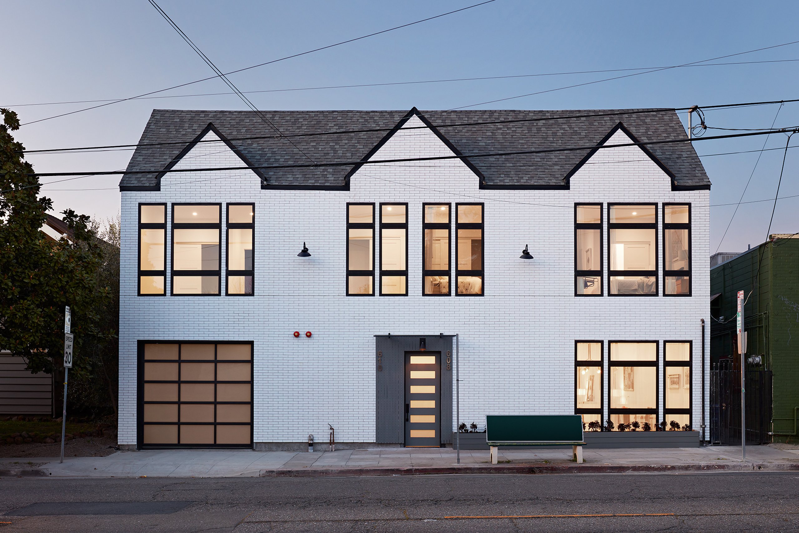
8th ave
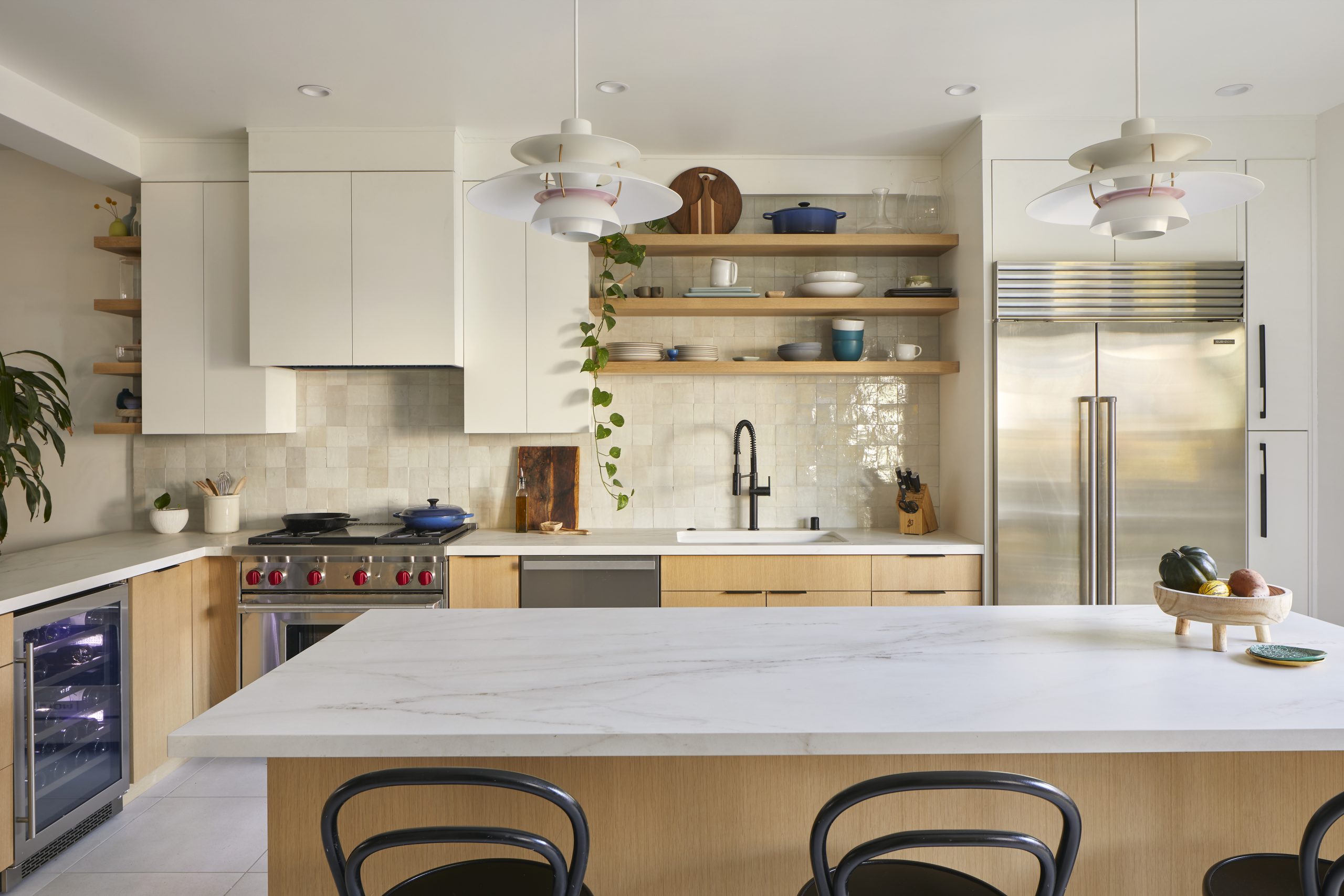
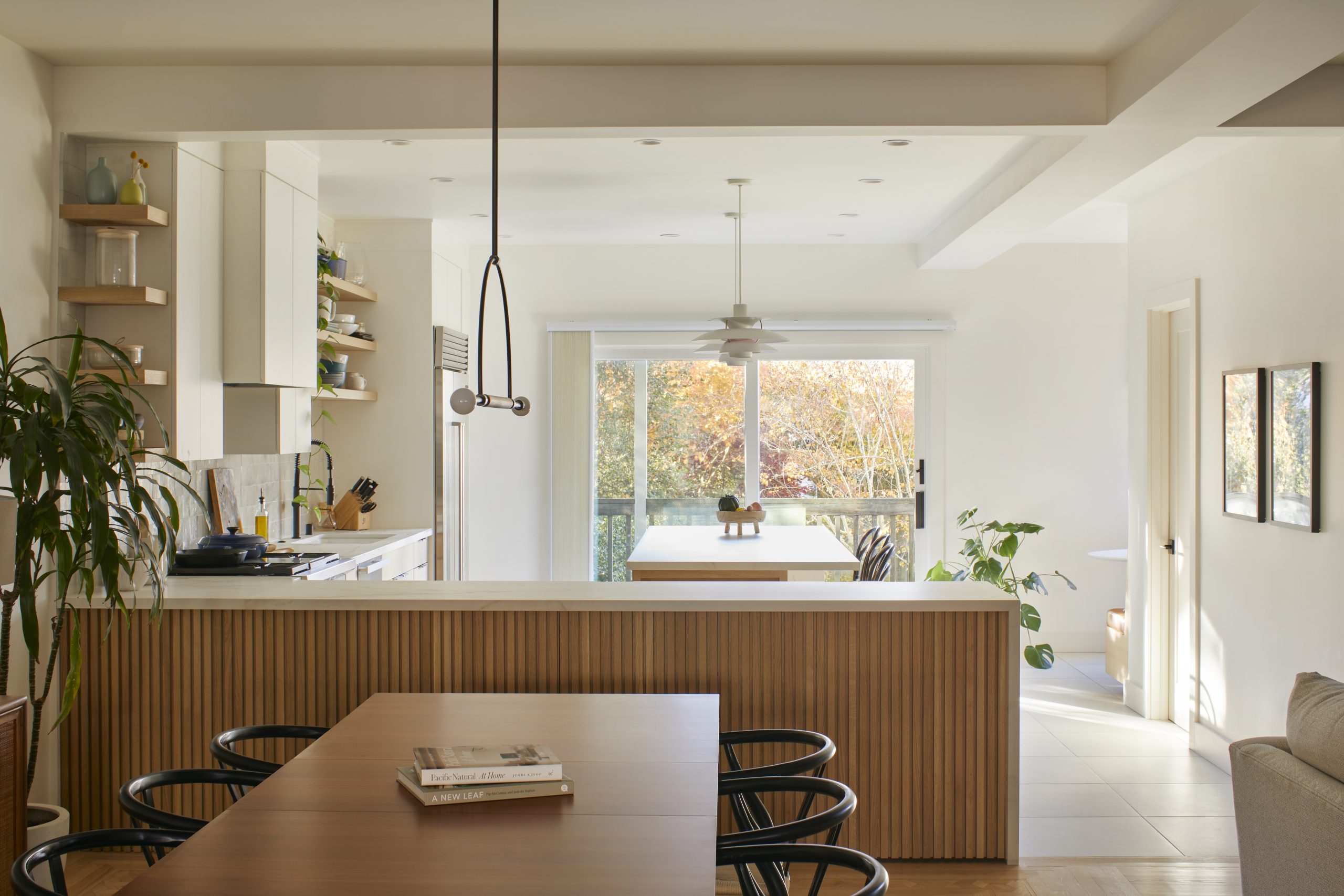
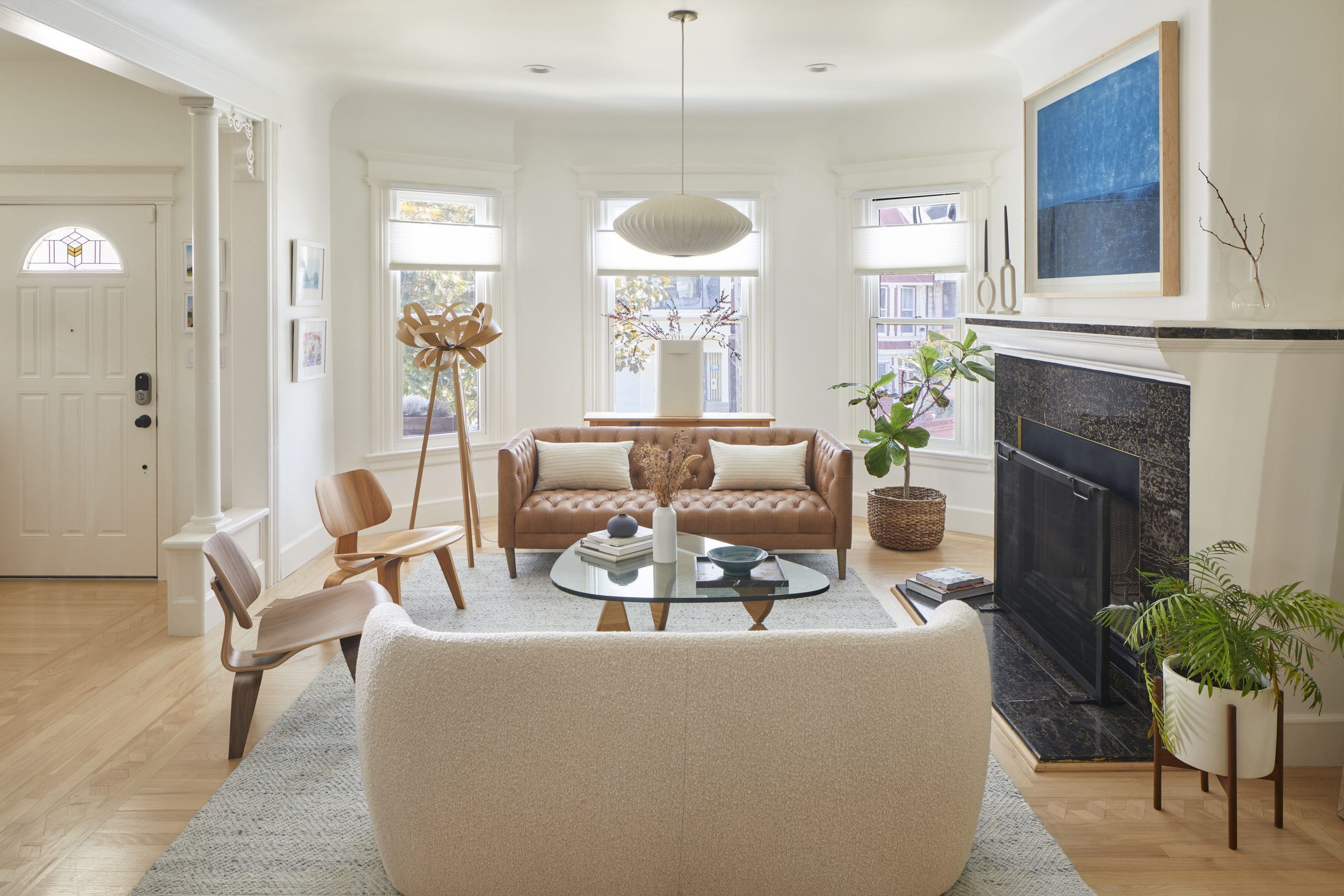
A juxtaposition of historic architectural qualities, with its Victorian flare, next to the contemporary look of the kitchen and dining area.
- LOCATION
- San Francisco, CA
- Status
- Built
- Program
- Single Family Home
- COLLABORATORS
- Base Design Structural
Current Construction
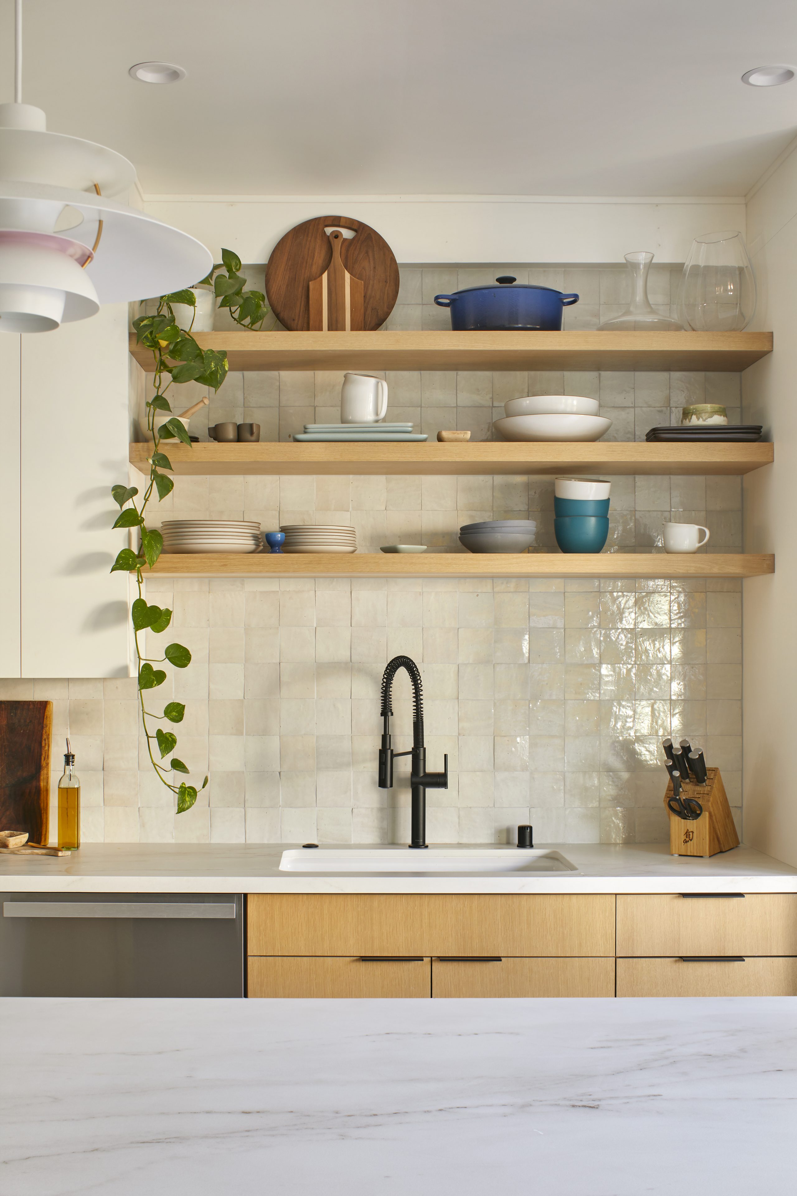
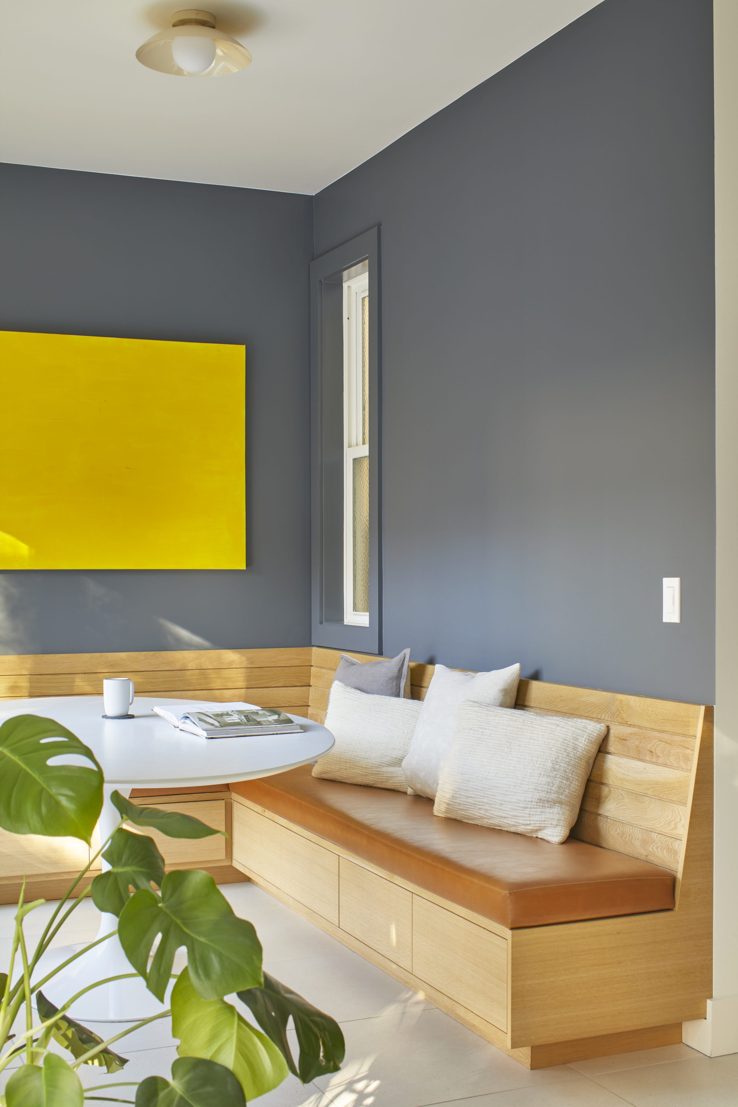
Nested in the Richmond district of San Francisco, 8th Ave Residence went through a major overhaul to maximize living space for a growing young family of four, with flexible jobs and extended family visiting regularly. We opened up and connected the kitchen to the rest of the house and gave a complete new Scandinavian look to this classic Victorian jewel.
This neighborhood is historically known as “outside lands”, due to its being “outside” the original city boundaries when California became a state in 1850. Surrounded by rows of Victorian homes, the house was originally built for a large extended family, housing multiple family members in one large unit.
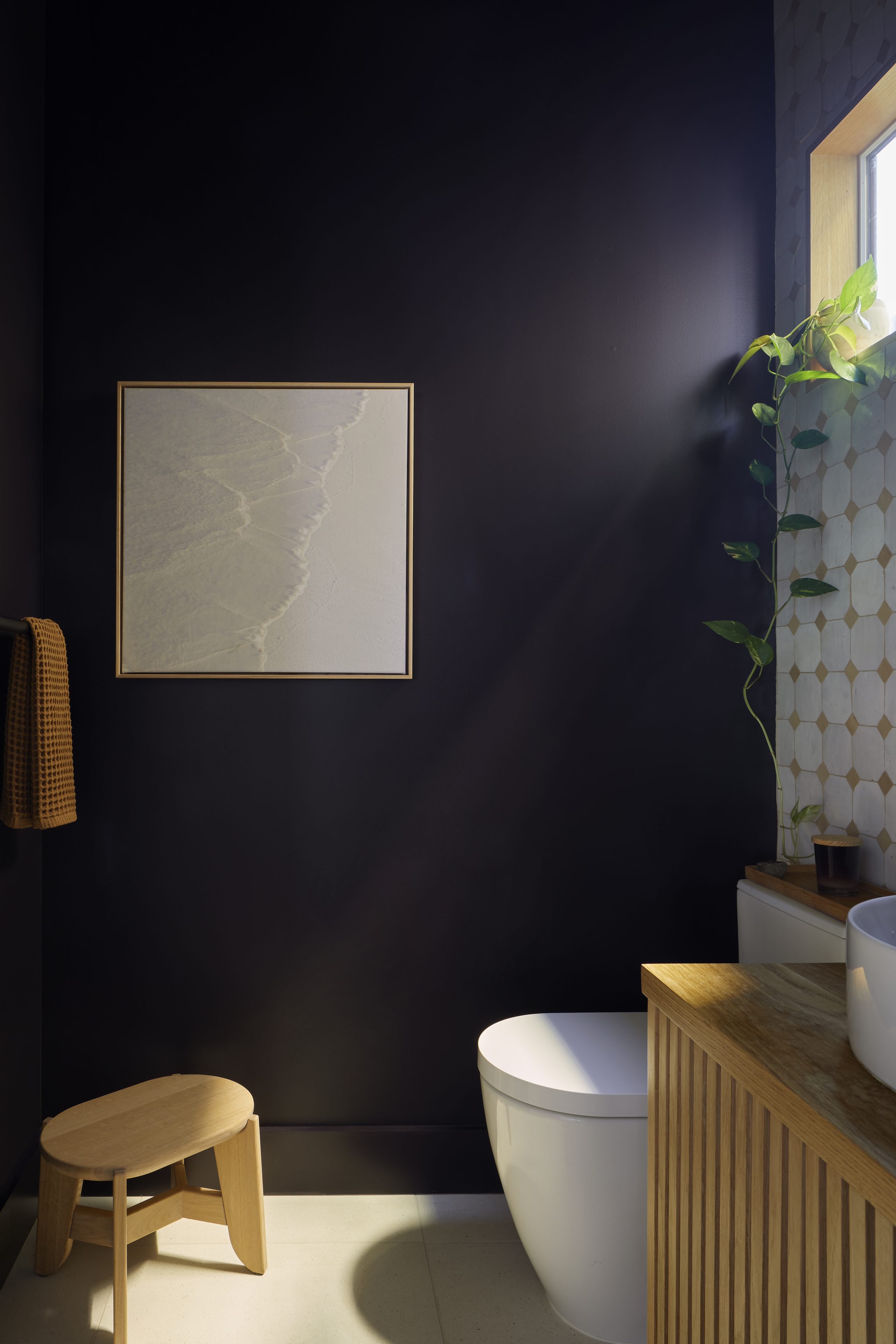
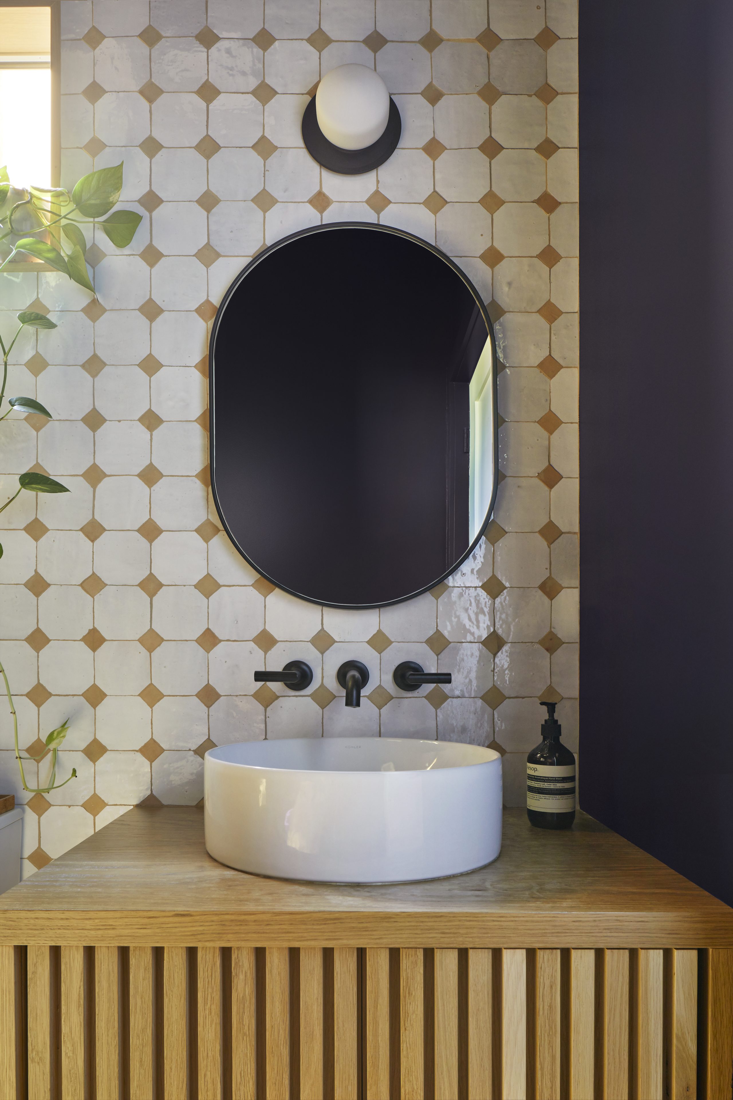
Our clients came to us with one primary goal – to make their house comfortable, open, airy and bright, and to accommodate the frequent visit of their extended family and friends. A modified layout for all three levels of the house maximizes city views to the backyard and natural light, flowing through the kitchen and living room. At the ground level, a spacious mudroom connects the garage to the main staircase that takes you through all parts of the house. The space under the stairs is cleverly designed to accommodate additional storage, and a floating bench allows for the kids (and the parents) to tie and untie their shoelaces comfortably. An existing guest bathroom is refreshed with new tile and vanity, with simple black and white tones and matte finishes. The simple geometry of rectangular tiles are transformed into a playful pattern by orienting them in different directions, which contrast with the playful geometry of hexagonal tiles on the floor. The new ground level of the house has an easy flow into the backyard, the garage, and the living spaces above.
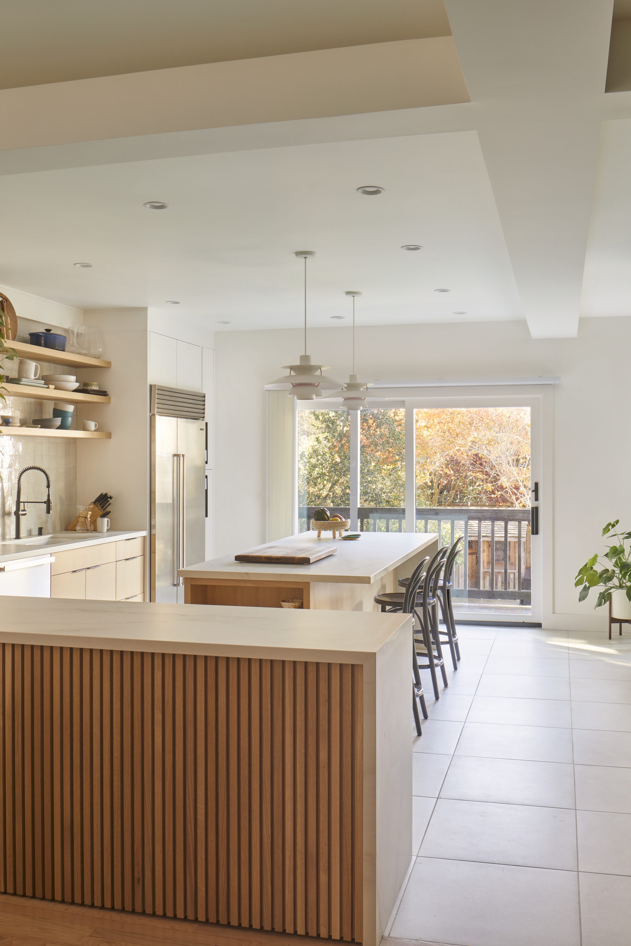
The main living room level and kitchen space is the primary design focus of the remodel. With the value of connectivity, places for conversing and gathering, and more importantly, openness and brightness in mind, we tackled the very closed off existing layout.The existing bathroom was transformed into a bright and airy breakfast nook, with a large window added to overlook the yard.
Overall, there is a dichotomy between old and new present at the main level, creating a juxtaposition of historic architectural qualities, with its Victorian flare, next to the contemporary look of the kitchen and dining area. As you walk through this space, you are able to experience the change in architectural qualities and styles. The front of the house living room is furnished with mid-century modern furniture, embracing the old crown moldings, classic fireplace, and the existing intricate hardwood flooring is preserved and refurbished where necessary. While the new kitchen and dining area has a fresh new look.
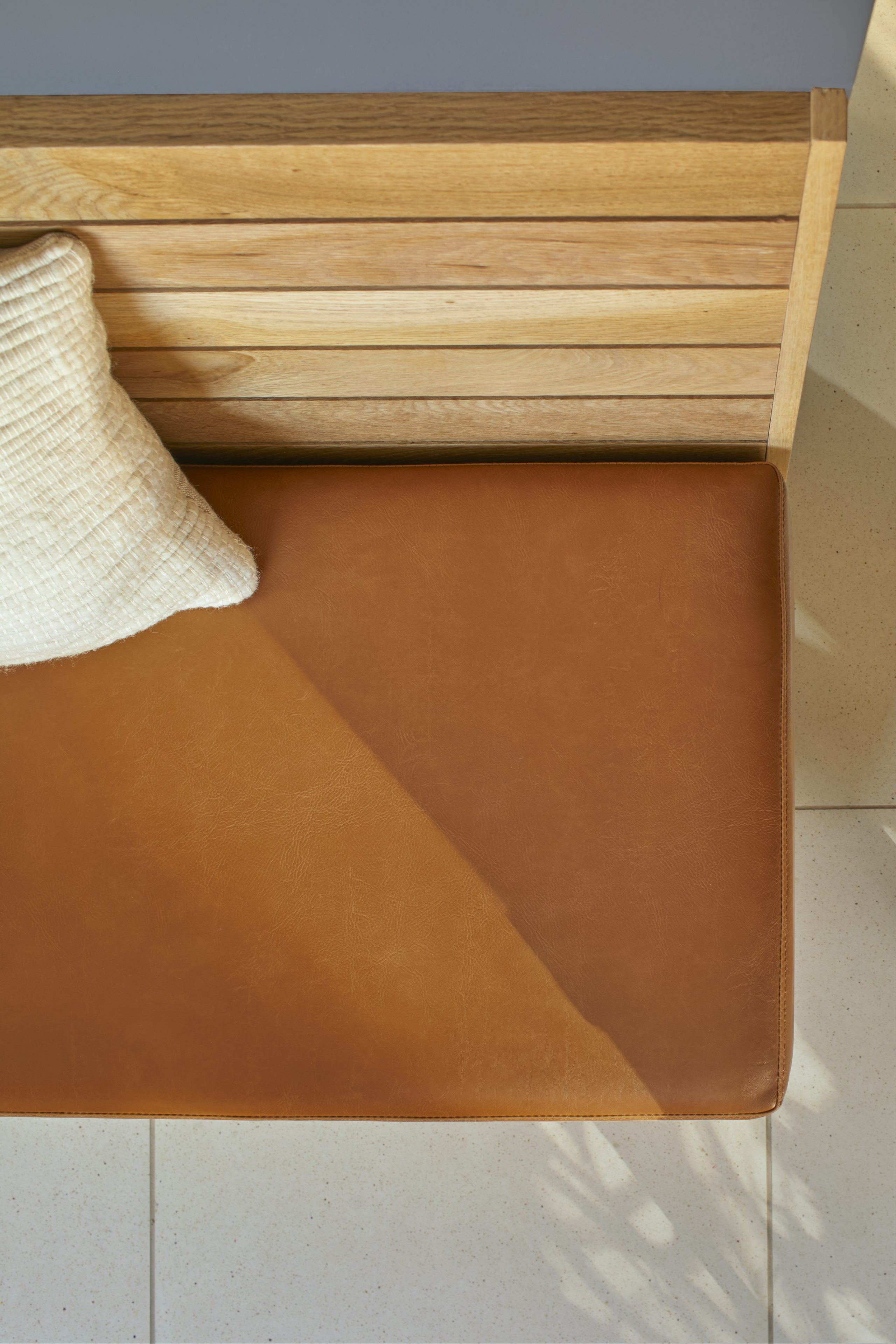
With the Scandinavian color and material theme in mind, the palette for the “new world” section of the house is carefully crafted to tailor the desires of our client for a clean look, and to create the called-for juxtaposition. Matte finish countertops and minimalist white upper cabinets sit calmly next to touches of natural white oak open shelving and base cabinets, while slatted wood paneling brings a flicker of rhythm and pattern to the space. The open kitchen floor is covered with large format Nasco terrazzo flooring, and the kitchen backsplash pours a level of texture and crafty look by using Zia Zellige tiles. All in all, the color theme remains clean, simple and calm.
The new breakfast nook with a built-in bench becomes the centerpiece of the kitchen, a perfect place for kids to play, paint and eat their breakfast, while looking out the framed views of the city and backyard landscape.
